Financial Statement Analysis Comparing Apples and Oranges (and Everything Else)
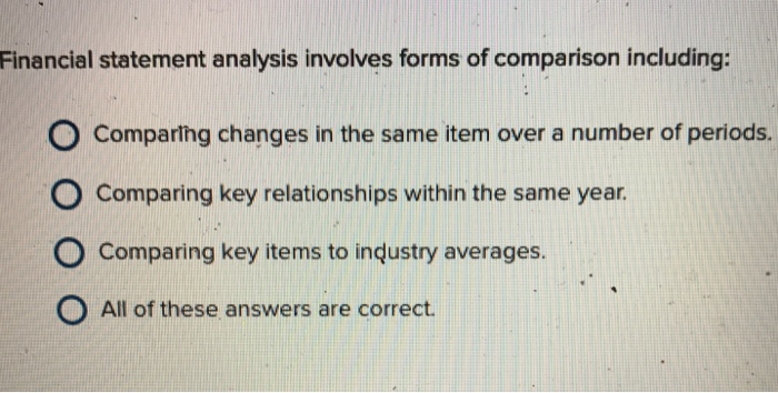
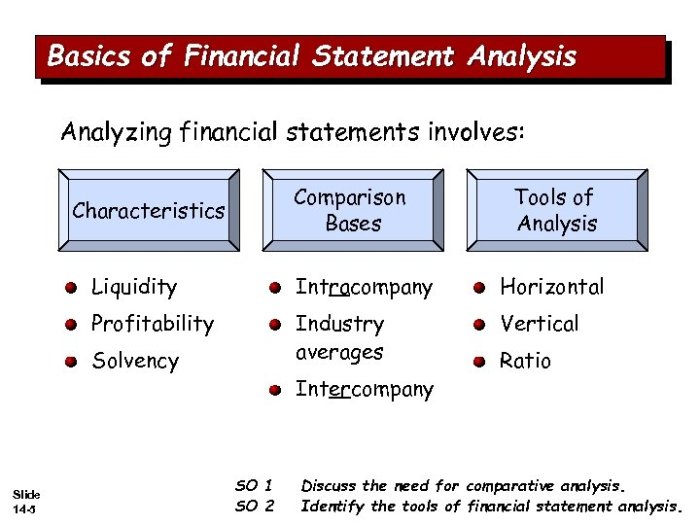
Financial statement analysis involves forms of comparison including: horizontal, vertical, and ratio analysis, not to mention the thrilling sport of benchmarking against competitors. Think of it as a financial detective story, where you piece together clues from balance sheets and income statements to uncover a company’s true financial health. It’s less about crunching numbers and more about interpreting the narrative those numbers tell—a narrative filled with suspense, twists, and perhaps, the occasional accounting scandal (though hopefully not!). We’ll explore these methods, revealing the secrets hidden within those seemingly dry financial reports.
This exploration will cover the various techniques used to analyze financial statements, explaining how to calculate key ratios, interpret trends, and compare performance against industry benchmarks. We’ll navigate the complexities of horizontal and vertical analysis, demystifying the processes and revealing their power in uncovering both strengths and weaknesses within a company’s financial profile. Get ready to become a financial statement Sherlock Holmes!
Horizontal Analysis

Having established the groundwork for financial statement analysis, and having already addressed the importance of a solid foundation, let’s delve into the exciting world of horizontal analysis – a technique that allows us to witness the breathtaking spectacle of financial trends unfolding before our very eyes! Think of it as a time-lapse video of your company’s financial performance, revealing the dramatic shifts and subtle nuances over time.
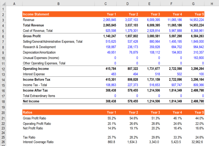
Horizontal analysis, in its purest form, involves comparing financial statement items across different periods. It’s like a financial detective story, where we track the clues (financial data) across several years to uncover the underlying narrative of the company’s financial health. This comparison is typically expressed as a percentage change, providing a clear and concise picture of growth or decline. Calculating these percentage changes is a surprisingly straightforward affair, and we’ll see exactly how to do it in the next section.
Calculating Percentage Changes
The process of calculating percentage changes in horizontal analysis is delightfully simple, almost embarrassingly so. To determine the percentage change between two years, we follow this foolproof formula:
[(Current Year Value – Prior Year Value) / Prior Year Value] * 100
. For instance, if a company’s revenue was $100,000 in Year 1 and $120,000 in Year 2, the percentage change would be [(120,000 – 100,000) / 100,000] * 100 = 20%. A 20% increase! We can apply this formula to all line items in the financial statements to see the overall picture. Remember, a positive percentage indicates growth, while a negative percentage indicates, well, the opposite.
Key Financial Ratios Benefiting from Horizontal Analysis
Several key financial ratios truly shine when viewed through the lens of horizontal analysis. Tracking these ratios over time allows for a deeper understanding of a company’s financial performance and potential future trends. Let’s examine a few key examples:
| Ratio Name | Formula | Year 1 Value | Year 2 Value | Percentage Change |
|---|---|---|---|---|
| Gross Profit Margin | Gross Profit / Revenue | 40% | 45% | 12.5% |
| Net Profit Margin | Net Income / Revenue | 10% | 12% | 20% |
| Current Ratio | Current Assets / Current Liabilities | 1.5 | 1.8 | 20% |
| Debt-to-Equity Ratio | Total Debt / Total Equity | 0.5 | 0.6 | 20% |
Note: The values presented are purely illustrative examples. Real-world values will vary considerably depending on the specific company and industry.
Limitations of Horizontal Analysis
While horizontal analysis provides a valuable perspective on financial trends, it’s crucial to acknowledge its limitations. Relying solely on horizontal analysis for decision-making can be akin to navigating by the stars alone – useful, but not the complete picture. For example, horizontal analysis doesn’t provide context; a 20% increase in revenue might seem impressive, but it’s less so if the industry average is a 30% increase. Furthermore, it doesn’t explain *why* the changes occurred. Was it due to strategic decisions, external factors, or a combination of both? To truly understand the “why,” further investigation is necessary, potentially involving vertical analysis, benchmarking, or other analytical techniques. It’s best used in conjunction with other analytical tools for a comprehensive assessment.
Vertical Analysis: Financial Statement Analysis Involves Forms Of Comparison Including:

Vertical analysis, unlike its horizontally challenged cousin, focuses its laser-like gaze on a single year’s financial statement. It’s like taking a magnifying glass to your financial snapshot, revealing the relative size and importance of each item. Think of it as a financial statement’s personality test, revealing its strengths and weaknesses in a concise and revealing manner. By expressing each line item as a percentage of a base figure, vertical analysis transforms raw numbers into insightful proportions.
Vertical analysis achieves its magic by expressing each line item as a percentage of a base figure. For the balance sheet, this base is typically total assets; for the income statement, it’s usually net sales or revenue. This transformation allows for easy comparison across different companies, regardless of their size, and reveals the relative contribution of each item to the whole. The formula for calculating these common-size percentages is delightfully simple:
(Individual Item / Base Figure) * 100%
. It’s so simple, even a chimpanzee with a calculator could do it (though we wouldn’t recommend it; the results might be… hairy).
Common-Size Financial Statement Calculations, Financial statement analysis involves forms of comparison including:
This section details the calculation of common-size financial statements, demonstrating how to express individual items as percentages of a base figure for both the balance sheet and income statement. Let’s assume a company, “Acme Explosives,” has the following figures. Note that this is purely for illustrative purposes; we wouldn’t want anyone to actually use Acme Explosives’ financial statements as a basis for any significant decisions.
Let’s say Acme Explosives’ Balance Sheet shows Total Assets of $1,000,000. If Cash is $100,000, the common-size percentage for Cash would be ($100,000 / $1,000,000) * 100% = 10%. Similarly, if Net Sales on the Income Statement are $2,000,000 and Cost of Goods Sold is $1,500,000, then the common-size percentage for Cost of Goods Sold would be ($1,500,000 / $2,000,000) * 100% = 75%. Repeating this calculation for every item creates a common-size statement.
Insightful Comparisons Using Vertical Analysis
Vertical analysis provides a wealth of comparative insights. The following bullet points highlight some key comparisons that can be drawn from both the balance sheet and income statement.
- Balance Sheet: Comparing the proportion of current assets to total assets reveals the company’s liquidity position. A high percentage suggests a strong ability to meet short-term obligations; a low percentage may signal potential liquidity problems. Similarly, a high percentage of long-term debt relative to total assets might indicate a higher financial risk.
- Balance Sheet: Examining the proportion of inventory to total assets can highlight potential issues with inventory management. An unusually high percentage could suggest obsolete inventory or inefficient inventory control, while a very low percentage might indicate supply chain issues.
- Income Statement: Analyzing the percentage of cost of goods sold to net sales provides insight into a company’s cost efficiency. A high percentage may indicate high production costs or inefficient operations, while a low percentage suggests better cost control and higher profit margins.
- Income Statement: Comparing the proportion of operating expenses to net sales reveals the efficiency of a company’s operations. High operating expenses relative to sales might indicate areas for improvement in cost management.
Identifying Strengths and Weaknesses
Vertical analysis is a powerful tool for identifying both areas of strength and weakness within a company. By comparing the common-size percentages of different items over time or against industry averages, analysts can pinpoint areas where a company excels or lags behind its competitors. For example, consistently high profit margins compared to industry averages could suggest a competitive advantage, while low return on assets might indicate a need for improvement in operational efficiency. Identifying these strengths and weaknesses allows for more informed decision-making and strategic planning.
Ratio Analysis

Having bravely wrestled with horizontal and vertical analysis, we now arrive at the thrilling world of ratio analysis – a financial detective’s playground where numbers dance and tell tales of a company’s triumphs and tribulations. It’s less about crunching numbers and more about interpreting the stories those numbers whisper. Think of it as financial fortune-telling, but with fewer crystal balls and more balance sheets.
Ratio analysis involves calculating and interpreting various ratios derived from a company’s financial statements to gain insights into its financial health, performance, and operational efficiency. It’s like having a financial X-ray, revealing the inner workings of a business. Unlike a regular X-ray, however, this one can be understood with a little bit of accounting know-how (and perhaps a healthy dose of caffeine).
Comparison of Liquidity, Solvency, and Profitability Ratios
The following table compares and contrasts the uses of liquidity, solvency, and profitability ratios. These ratios, while distinct, often work together to provide a holistic view of a company’s financial standing. Think of them as a financial superhero team, each with unique abilities, but ultimately working together for the greater good (of understanding the company’s finances).
| Ratio Type | Purpose | Key Ratios (Examples) |
|---|---|---|
| Liquidity Ratios | Assess a company’s ability to meet its short-term obligations. Think of it as checking if the company has enough readily available cash to pay its bills on time – no bounced checks allowed! | Current Ratio, Quick Ratio, Cash Ratio |
| Solvency Ratios | Measure a company’s ability to meet its long-term obligations. This is about the long game – can the company survive over the long haul? | Debt-to-Equity Ratio, Times Interest Earned Ratio, Debt-to-Asset Ratio |
| Profitability Ratios | Evaluate a company’s ability to generate profits. Are they making money? And if so, how much? This is the ultimate question. | Gross Profit Margin, Net Profit Margin, Return on Equity (ROE) |
Key Financial Ratios and Their Significance
Understanding key financial ratios is crucial for assessing a company’s financial health. These ratios provide valuable insights into various aspects of a business, from its short-term liquidity to its long-term solvency and overall profitability. Ignoring them is like navigating a ship without a compass – you might eventually reach your destination, but it’ll be a bumpy ride.
Below are five key financial ratios and their significance:
- Current Ratio: Current Assets / Current Liabilities. Indicates a company’s ability to pay its short-term debts. A higher ratio suggests better liquidity.
- Debt-to-Equity Ratio: Total Debt / Total Equity. Shows the proportion of a company’s financing that comes from debt versus equity. A higher ratio indicates higher financial risk.
- Net Profit Margin: Net Profit / Revenue. Measures the percentage of revenue that translates into profit after all expenses are considered. A higher margin indicates better profitability.
- Return on Equity (ROE): Net Profit / Shareholders’ Equity. Measures how effectively a company is using its shareholders’ investments to generate profit. A higher ROE is generally preferred.
- Inventory Turnover: Cost of Goods Sold / Average Inventory. Shows how efficiently a company is managing its inventory. A higher turnover indicates faster inventory movement and potentially better efficiency.
Hypothetical Scenario Illustrating Ratio Analysis
Let’s imagine “Widget Wonders,” a company manufacturing and selling quirky widgets. Their financial statements reveal a high current ratio (2.5), suggesting strong short-term liquidity. However, their debt-to-equity ratio is also high (1.8), indicating significant reliance on debt financing. Their net profit margin is moderate (10%), while their inventory turnover is low, suggesting potential issues with inventory management.
By analyzing these ratios together, we can form a comprehensive assessment. While Widget Wonders has good short-term liquidity, their high debt level raises concerns about long-term solvency. The moderate profit margin and low inventory turnover suggest areas for improvement in operational efficiency. This combined analysis provides a more nuanced understanding than looking at individual ratios in isolation. It’s a complete financial picture, not just a snapshot.
Benchmarking

Benchmarking: a noble quest to see how your company stacks up against the titans (or, let’s be honest, sometimes the slightly less impressive dwarves) of your industry. It’s the financial equivalent of comparing your biceps to Arnold Schwarzenegger’s – aspirational, perhaps slightly humbling, and definitely illuminating. But choosing the right benchmarks? That’s where the real fun (and potential for comedic mishaps) begins.
Selecting appropriate benchmarks requires a discerning eye and a healthy dose of skepticism. Simply grabbing the nearest industry average can be like using a rusty yardstick to measure the height of a skyscraper – you might get a number, but it won’t be very accurate. Consider factors such as company size, geographic location, product diversification, and business model. A small, niche player shouldn’t be compared to a multinational behemoth, any more than a boutique bakery should be judged against a global fast-food chain. Apples and oranges, as they say, though perhaps in this case, it’s more like comparing apples to… spaceships.
Challenges in Benchmark Selection
The selection of appropriate benchmarks presents several significant challenges. Companies must carefully consider the comparability of their operations and financial reporting practices with those of their chosen benchmarks. Differences in accounting standards, business models, and industry-specific factors can significantly distort the results of the comparison. Furthermore, the availability of reliable and up-to-date industry average data can be limited, particularly for smaller or more specialized industries. Finally, the inherent subjectivity in selecting benchmarks can lead to biased or misleading conclusions, if not carefully managed. Choosing the wrong benchmarks can lead to inaccurate assessments, potentially resulting in misguided strategic decisions.
Collecting and Organizing Industry Average Data
Gathering data for benchmarking is a treasure hunt, requiring resourcefulness and a dash of detective work. Industry reports from reputable firms like Dun & Bradstreet or IBISWorld offer a good starting point. Trade associations often publish industry statistics, although the level of detail and accuracy can vary. Government databases, like those maintained by the SEC (for publicly traded companies), can also provide valuable information. Remember to cross-reference data from multiple sources to ensure accuracy and identify any potential outliers or inconsistencies. Once the data is gathered, organize it systematically, ideally in a spreadsheet or database, to facilitate easy analysis and comparison.
Interpreting Deviations from Industry Averages
Understanding the deviations from industry averages requires careful analysis, not just a quick glance. A simple positive or negative deviation doesn’t tell the whole story. Consider the magnitude of the deviation, its consistency over time, and the underlying reasons for any significant differences. For example, a significantly higher debt-to-equity ratio could indicate aggressive growth strategies, but it could also be a warning sign of financial distress. Context is king!
| Ratio | Company Value | Industry Average | Deviation Analysis |
|---|---|---|---|
| Current Ratio | 1.8 | 2.2 | Company’s liquidity is slightly lower than the industry average, potentially indicating a need for improved working capital management. Further investigation is needed to determine if this is a cause for concern. |
| Profit Margin | 8% | 10% | Company’s profit margin is lower than the industry average. This could be due to higher costs, lower pricing strategies, or less efficient operations. A deeper dive into cost structure and pricing is warranted. |
| Return on Equity (ROE) | 15% | 12% | Company’s ROE is higher than the industry average, suggesting potentially superior efficiency in utilizing shareholder equity. This warrants further investigation to identify the key drivers of this superior performance. |
Trend Analysis (Beyond Horizontal)

Horizontal analysis, while a valiant effort, only offers a fleeting glimpse into the financial crystal ball. To truly understand a company’s destiny, we must embrace the majestic power of trend analysis – a journey through time, revealing the epic saga of its financial performance over several years, perhaps even a decade or more. This isn’t just about spotting blips; it’s about identifying the grand narrative, the sweeping arcs of growth, decline, and – dare we say it – glorious resurgence.
Trend analysis takes the somewhat short-sighted horizontal analysis and stretches it out, like a particularly delicious taffy, revealing patterns and cycles that would otherwise remain hidden. By charting key financial metrics – revenue, net income, debt levels, etc. – over an extended period, we can uncover long-term trends that offer valuable insights into a company’s sustainability and future prospects. Think of it as financial archaeology, excavating the past to illuminate the future.
Visualizing Long-Term Financial Trends
A simple yet effective method for visualizing long-term trends is to create line graphs. For example, plotting a company’s net income over a ten-year period allows us to observe any upward or downward trends. Each data point on the graph represents the net income for a specific year, clearly showing the progression over time. Significant increases or decreases can be readily identified, along with periods of stability or volatility. Crucially, the slope of the line itself is informative; a consistently upward-sloping line indicates strong growth, while a downward slope signals trouble in paradise. Analyzing these slopes over time allows for the identification of acceleration or deceleration in growth or decline, offering even more detailed insights. For example, a line that initially slopes steeply upward but then flattens suggests a potential slowdown in growth that warrants further investigation.
Considering External Factors in Trend Analysis
Interpreting long-term trends requires more than just staring at pretty graphs. We must consider the context – the tumultuous tides of the external environment. Economic booms and busts, industry-specific regulations, technological disruptions, and even changes in consumer preferences can all significantly influence a company’s financial performance. For instance, a decline in a company’s revenue during a recession might not necessarily indicate poor management; it could simply reflect the broader economic downturn. Conversely, a period of exceptional growth might be fueled by a favorable regulatory environment or a technological breakthrough, rather than solely the company’s internal strategies. Ignoring these external factors is akin to analyzing a single piece of a complex puzzle – you’ll never see the whole picture.
Impact of a Significant Long-Term Trend: Increasing Debt Levels
Let’s imagine a company experiencing a consistent increase in its debt levels over a five-year period. While this might initially seem alarming, a deeper analysis is required. If the increased debt is funding profitable investments (e.g., expanding production capacity, acquiring a key competitor), it could be a positive sign of strategic growth. However, if the debt is being used to cover operating losses or fund lavish executive bonuses, it could signal serious financial distress. Furthermore, the level of debt relative to the company’s equity (leverage) is critical. High leverage increases financial risk, making the company more vulnerable to economic downturns and potentially impacting its credit rating, making future borrowing more expensive or even impossible. A company with consistently increasing debt levels, particularly high leverage, might struggle to meet its financial obligations, potentially leading to bankruptcy or a significant restructuring. This scenario is not merely hypothetical; many real-world examples exist, illustrating the potential consequences of unchecked debt accumulation. For example, the struggles of many retailers in the face of increased online competition and changing consumer habits have often been exacerbated by high debt burdens.
Closing Notes

So, there you have it: a whirlwind tour of financial statement analysis. While mastering these techniques won’t instantly transform you into Warren Buffett (sorry!), it will equip you with the analytical skills to dissect financial statements, identify trends, and make more informed decisions. Remember, the key is not just calculating the numbers, but understanding the story they tell. Happy analyzing!
Expert Answers
What’s the difference between horizontal and vertical analysis?
Horizontal analysis tracks changes over time (year-over-year), while vertical analysis compares items within a single year’s statement (as percentages of a base figure).
Why is benchmarking important?
Benchmarking allows you to see how a company performs relative to its industry peers, providing valuable context and highlighting areas for improvement or competitive advantage.
Can I use only one type of analysis for a complete picture?
No. A comprehensive analysis typically combines several methods for a holistic view of a company’s financial health. Using just one method is like trying to solve a puzzle with only one piece.
What are some common pitfalls to avoid in financial statement analysis?
Beware of cherry-picking data, ignoring qualitative factors, and failing to consider the broader economic context. Remember, numbers only tell part of the story.


